Widget Style Customization Guide
Introduction
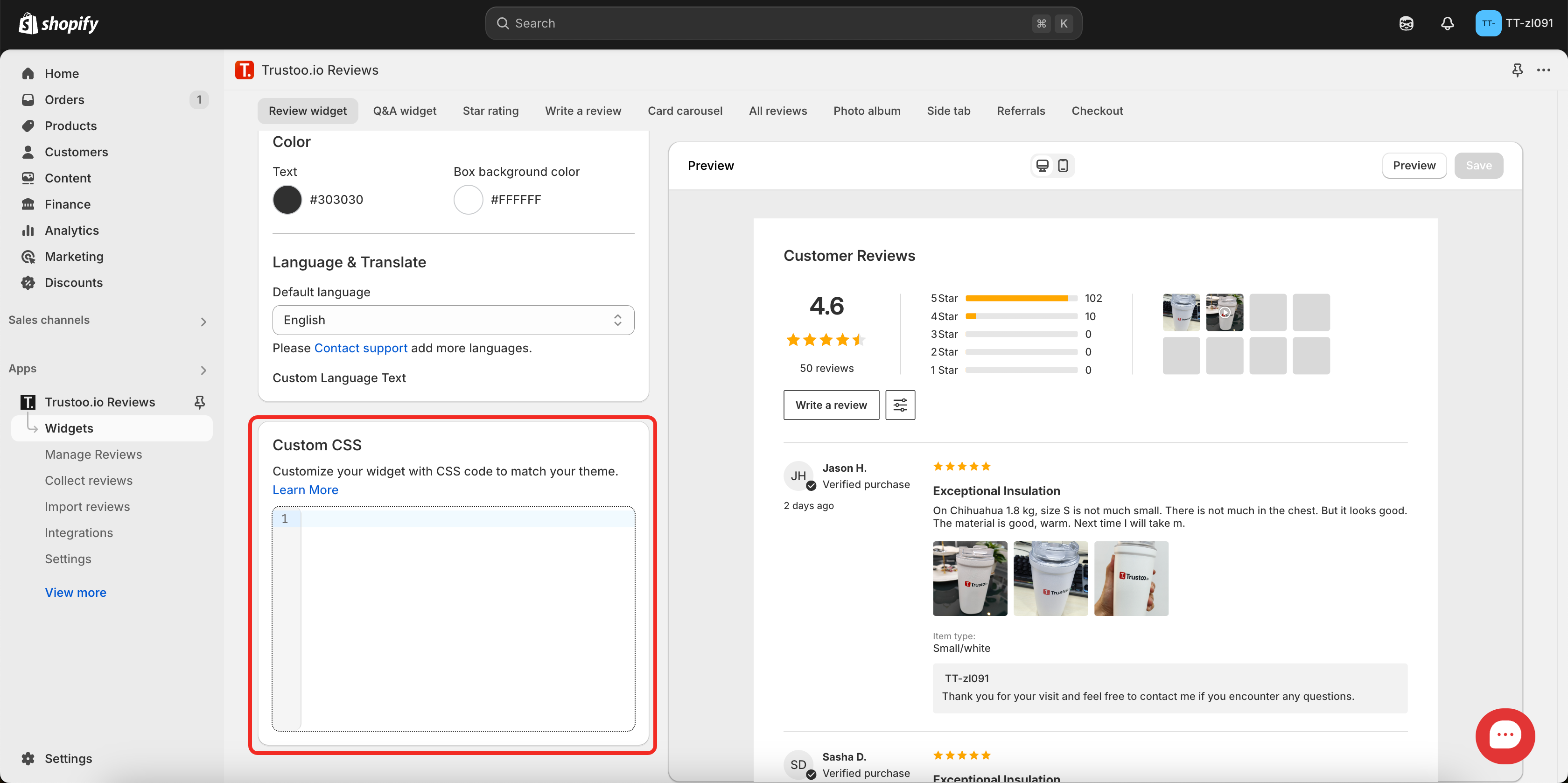
In the widget section, you can customize the bottom area using code to personalize your widget styles. This includes customization for star ratings, carousels, and other components.
1. Reviews Widget Settings
1.1 Width and Margin Settings
Width Settings:
Using "initial" won't restrict the maximum width, while setting a specific value like "1600px" will limit the comment area width to 1600 pixels.
.trustoo-reviews-wrapper>#vstar-reviews.trustoo-widget { max-width: initial; }
Margin Settings:
The first value sets top and bottom padding, while the second value sets left and right padding. For example, padding: 0px 20px creates 0px padding vertically and 20px padding horizontally.
.trustoo-reviews-wrapper>#vstar-reviews.trustoo-widget { padding: 0px 20px; }
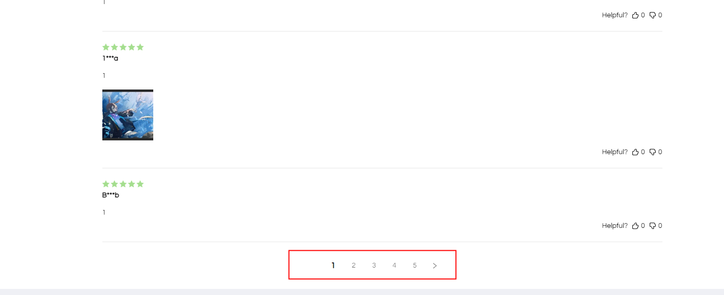
1.2 Hide UI Elements
Remove Sorting Button
#vstar-reviews div.head-sort {
    display: none;
}
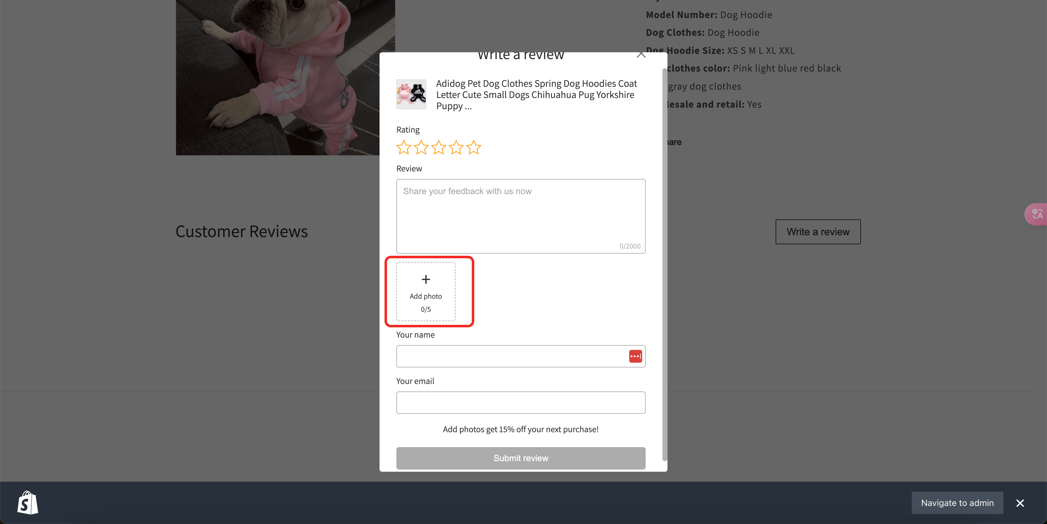
Hide Photo Upload Option
.trustoo-write-review .upload-area {
    display: none !important;
}
1.3 Additional Widget Customizations
Change Font to graphie-regular
.trustoo-widget p,
.trustoo-widget button,
.trustoo-widget span,
.trustoo-widget div,
.trustoo-widget input,
.trustoo-widget textarea {
    font-family: 'graphie-regular';
}
Hide Widget for No-Review Products
#noreviews-wrapper {
    display: none !important;
}
Remove Pagination
#vstar-reviews #reviews-footer {
    display: none !important;
}
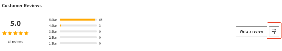
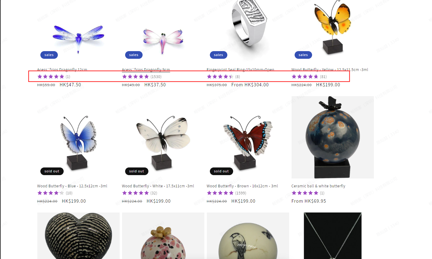
2. Star Rating Widget Settings
2.1 Icon Size Settings
Product Page Rating Icons
.product-icon-list .star-item,
.product-icon-list svg {
    width: 18px !important;
    height: 18px !important; /* Default size is 20px */
}
Collection Page Rating Icons
.collection-icon-list .star-item,
.collection-icon-list svg {
    width: 16px !important;
    height: 16px !important; /* Default size is 16px */
}
2.2 Text Color Settings
.product-icon-list.vstar-star > .tt-rating-text {
    color: white !important;
    /* You can use color names, hex (#fff) or RGB values (rgb(255,255,255)) */
}
2.3 Margin Adjustments
.product-icon-list.vstar-star {
    margin-top: 10px !important; /* Default top margin is 10px */
    margin-bottom: 10px !important; /* Default bottom margin is 15px */
}
2.4 Additional Customizations
Show Review Tab on Left Side
body > #vstar-tab {
    left: 0;
    right: initial;
    transform: translate(-50%, 0) rotate(-90deg);
    transform-origin: 50% 0%;
}
Add More Space Under Star Rating
div.collection-icon-list.vstar-star {
    margin-bottom: 15px;
}
3. Carousel Widget Settings
3.1 Image and Text Carousel
Width Settings:
Using "initial" won't restrict the maximum width, while setting a specific value like "1600px" will limit the comment area width to 1600 pixels.
#tt-carousel[data-type=primary] { max-width: initial !important; }
Margin Settings:
#tt-carousel[data-type=primary] { padding: 10px 20px; }
Image Size Settings:
#tt-carousel[data-type=primary] .tt-card-footer .resource-list,#tt-carousel[data-type=primary] .tt-card-footer .tt-reviews-image { width: 100px; height: 100px; }
3.2 Text-only Carousel
Width Settings:
Using "initial" won't restrict the maximum width, while setting a specific value like "1600px" will limit the comment area width to 1600 pixels.
#tt-carousel[data-type=text]>.tt-swiper-wrapper { max-width: initial !important; }
Margin Settings:
#tt-carousel[data-type=text]>.tt-swiper-wrapper { padding: 10px 20px; }
3.3 Photo Carousel
Width Settings:
Using "initial" won't restrict the maximum width, while setting a specific value like "1600px" will limit the comment area width to 1600 pixels.
#tt-carousel[data-type=photo]>.tt-swiper-wrapper { max-width: initial !important;padding: 0; }
Margin Settings:
#tt-carousel[data-type=photo]>.tt-swiper-wrapper { padding: 10px 20px; }
3.4 Testimonials Carousel
Width Settings:
Using "initial" won't restrict the maximum width, while setting a specific value like "1600px" will limit the comment area width to 1600 pixels.
#tt-carousel[data-type=barrage]>.tt-swiper-wrapper { max-width: initial !important;padding: 0; }
Margin Settings:
#tt-carousel[data-type=barrage]>.tt-swiper-wrapper { padding: 10px 20px; }
3.5 Instagram Feed Width
div#ins-area {
    width: 80%;
}
3.6 Reduce Review Size
#vstar-reviews .list-review-body-item {
    padding-top: 10px !important;
    padding-bottom: 10px !important;
}

#reviews-body .star,
#reviews-body .list-review-body-item-head {
    margin-bottom: 10px !important;
}

#reviews-body .img-list {
    margin-top: 10px !important;
}
4. Usage Tips
Size Unit Options
- Use pixels (px) or percentages (%)
- Consider responsive design requirements
Color Value Support
- Color names: white, black, etc.
- Hexadecimal: #fff, #000000
- RGB values: rgb(255, 255, 255)
Important Notes
- Use
!importantsparingly - Test across different screen sizes
- Consider adding media queries for mobile responsiveness
- Hidden elements will not be accessible to users
Best Practices
- Always preview changes before finalizing
- Ensure consistency across different device types
- Maintain a clean and intuitive user interface
- Test customizations thoroughly